Fundamentals of composition in design. What is composition?
In any form of art, the key role is played by the correct arrangement of the elements of the work, which allows you to most accurately convey the idea of this work. That is, highlight the key storylines, convey the necessary mood and maintain harmony. Composition (from the Latin compositio) is the combination (combination) of these elements into a single whole. The work itself can also be called a composition.
Everyone has an intuitive concept of composition to varying degrees. Otherwise there would be no point in it. That is, people have a similar idea of harmony, integrity, unity...
Composition in design, composition in drawing, composition in painting, composition in photography are inseparable concepts. Composition in music and composition in literature also have much in common with the above, but the means of achieving it are different.
Artists pay special attention to searching for the most expressive compositional schemes. Over the course of many centuries, works with various compositional solutions have been created, including works of fine art. However, in this article we will not consider complex works of art.
Any object can easily be fit into one of three basic shapes: rectangle, triangle, ellipse. So we will operate with these figures.
And we will consider the composition itself as the correct arrangement of image elements, based on a substantive study of human perception of visual information.
We will talk about composition in fine arts, composition in photography and, of course, design.
Geometric and compositional centers, means of highlighting the compositional center, planning in composition
We are building a composition on a plane. Whether it's a photograph, a piece of paper or a computer monitor. If we draw two diagonal lines through this plane, the point of their intersection will indicate the geometric center of our future composition.
Any object inscribed in this center will feel quite confident.
Composition center serves to focus the viewer's attention on the details of the composition. In photography, painting and drawing, as a rule, stand out plot-compositional centers. That is, the main plot of the work is in the compositional center. In advertising, highlighting the compositional center can be useful to attract attention potential buyer to information that interests him. This can be text or an image.
The compositional center and the geometric center of the composition may not coincide.
There can be several compositional centers in a composition, while there is only one geometric center.
The compositional center can be highlighted:
Contrast of light and shadow
Color contrast
Size
Shape
IN classical painting As a rule, the plot and compositional center is depicted in the background. The foreground serves as an introduction, an invitation to look at the main event. In the background is the entire plot of the work, and the third serves as a continuation of the picture, the background against which the action unfolds.

Part 2 Basic concepts and rules of composition
Diagonal lines in the composition

The graph on the left represents growth. The graph on the right shows a fall. It just so happened. And, accordingly, in a composition, a diagonal line drawn from the lower left corner to the upper right is perceived better than a line drawn from the upper left corner to the lower right.
Create a beautiful composition in landscape design– the task is not as simple as it might seem at first glance. Composition is not just making a whole out of parts. This is the creation of a whole that you want to stop your gaze on again and again. This is what gives us various positive emotions. It is the landscape composition that is the basis of good design, and it consists of only four main elements.

Lines in landscape composition can be horizontal, vertical, diagonal or curved. Lines are used in landscape design to emphasize an object, set a path of movement, or draw attention to a focal point, which could be, for example, fire, water or a small architectural form. Paths or an area of the garden with a direct route to a focal point will naturally direct a person to the accent area of the garden. In contrast, a winding path will create a sense of wonder.
Using a line, you can redirect a person's gaze to areas of greatest interest, and it doesn't matter what the line is. Therefore, when you set a route on your site, carefully consider where the main or secondary path will lead. The most common mistake is the path to nowhere. But this directs our gaze. And if we don’t see anything at the end of our path, then subconsciously we begin to be overcome by doubts about whether we need to go there at all. And this does not at all cause interest, but rather fear. And if at the end of the path we see a small architectural form, a beautiful sculpture, a bench or a tree with an interesting shape, our gaze calms down, and we smoothly move into a state of contemplation. And this is a completely different feeling.
If you decide to create winding paths on your site, then the principle of surprise applies here. The winding path is interesting, but not in itself. In this case, everyone sharp turn must necessarily contain an accent element that encourages you to move on. And here it will be better if the shape of the path is not completely visible, as in the palm of your hand; you need to make sure that each section or each curl is hidden, for example, behind a screen of plants. Then this will arouse a feeling of interest: what is there, around the corner?
One more point that I would like to highlight - do not skimp on paving paths in the garden, because it will serve you long years. Now the times have come that cannot tolerate alterations. Firstly, it is very expensive, and secondly, it is a waste of your precious time. How often do we see areas where paths simply connect the entrances of buildings to each other. Where is it here? landscape composition? There is none, so you cannot feel comfortable in such an area. Expand your horizons a little, open up the lawn in front of your house, create a beautiful flower garden on it, or plant a small decorative group of trees and shrubs. Believe me, you will look at such a landscape much more often than at a lawn cut by paths. In this case, your eyes will endlessly wander along the created lines in search of shelter.
Lines, whether real or imaginary (formed, for example, by planted plants), create general composition in the garden. It is the lines that create a sense of order and allow you to focus on the entire garden design as a whole, rather than on the individual details that make it up.
Form in landscape design composition
The forms of the landscape composition are created by contours closed in space and form three-dimensional objects. Small architectural elements and plants have a form, and it is they that organize the landscape, and often determine the entire landscape style of the garden. Formal geometric shapes are familiar to us as circles, squares and polygons. Free forms feature sinuous lines and blurred edges.
Plants create shape in the garden through their outlines and silhouettes, and their shape can change when grouped together. Whereas buildings and small architectural elements are permanent forms.
Circles in the composition

The circles have a durable construction. A person's gaze is always turned to his center, which is most often used as a place for emphasis. For variety in design, derivatives of the circle are also used - ellipse, segment, oval or semicircle.
Squares in composition
Squares are the generally accepted “construction” form. We often see it in paving paths, as well as in stone, brick or wooden structures and their finishing (tiles). Unlike a circle, a square is a more fundamental and difficult to perceive shape. The square shape can also be divided into segments, with which you can achieve another, unique and more complex shape.
Polygons in composition
Polygons (especially triangles) need to be treated with special care. Sharp corners are perceived as “prickly”, which creates a certain discomfort for a person. The simpler the polygon, the easier it is perceived by our vision.
Twisting shapes
 Twisting shapes
in landscape design
Free, sinuous forms often imitate the natural flow of rivers or streams. Such forms work well when creating paths, designing flower beds, designing ponds and dry streams. Winding lines can add mystery to a garden composition, revealing more and more views to the viewer.
Blurred or jagged edges imitate chips of natural stone and textured leaves, causing a feeling of roughness and roughness. Similar forms can be seen in rock gardens or along a dry stream, and these forms can also be reflected in small architectural forms Oh.
Fragmented Forms
Fragmented shapes resemble fragments of stone or brick and are often used in step paving.
Plant shape

The shape of the plants is the most interesting. It can change due to an increase in the number of plants when they are grouped. A shape that contrasts with other shapes in the overall composition will be an accent. Accent forms should be used with caution; there should be one or two of them, but if their number is too large, they can lead to chaos. Vertical shapes add height to a space, while horizontal shapes add width. The shape of plants is capable of changing the space of a landscape composition, introducing into it all kinds of convexities and concavities. For example, the shape of a tree with arched branches creates a concave space underneath that can be filled with a plant with a domed crown.
Trees have a wide variety of shapes, they can be: round and columnar, oval and pyramidal, vase-shaped and weeping. Various shapes trees are used not only for visual appeal, they also carry a functional load. For example, round and oval tree shapes are more suitable for creating shade in the garden, while screening requires a pyramidal or columnar shape.
Shapes of shrubs
Shapes of shrubs can be upright, vase-like, arched, mound-shaped, rounded, pointed, cascading and irregular. When choosing shrub forms, you need to consider whether they will be planted in a group or individually.
Ground-blooded forms
Ground cover forms include: carpet, prostrate, creeping, needle-shaped and clumpy. Almost all ground cover forms look better in masses.
Shape is a very powerful tool for recognizing and defining the subject of a composition based on its outline or silhouette. Human vision is capable of reproducing an object even if we see only part of the shape we are familiar with. Repetition of the same shape is necessary when creating a landscape design structure. Shapes also determine the style of the garden. Geometric shapes are the basis of regular gardens, and free forms It is preferable to use in landscape gardens that imitate nature.
Color in landscape composition
The colors of plants and small architectural forms add interest and variety to the landscape. Color is the most visible and, unfortunately, fickle element of landscape design. To create color schemes, we use a color wheel that includes three primary colors (red, blue, and yellow), three secondary colors (green, orange, and purple), and six tertiary colors (a mixture of secondary and primary colors).
The colors of the leaves and flowers of plants create the mood in the garden. In the landscape design of a summer cottage, color is used for visual effect. Colors should be in harmony with the overall appearance of the garden and accompany its changes from season to season. The main color schemes are monochrome, analog and complementary.
Monochrome color scheme
A monochrome color scheme uses one color. In landscaping, this means only one color other than the green of the foliage and grass. In the garden where it prevails green color, after all, shape and texture have a greater influence on emotional condition. But one color can have many light and dark variations, which adds variety to the general form. An example would be white garden with white flowers, white variegated foliage and white decorative elements.
Harmonious color scheme
An analogue or harmonious color scheme for a composition is made up of any three to five colors that are adjacent on the color wheel, such as red, red-orange, orange, yellow-orange and yellow, or blue, blue-violet and violet. Colors are related to each other because they usually contain two primary colors and, when mixed, form a secondary and two tertiary colors, sharing common properties.
Complementary color scheme
A complementary color scheme involves using opposites standing flowers in the color wheel. These colors tend to have high contrast. The most common combinations are: purple and yellow, red and green, blue and orange. Such combinations are often found in nature among flowers.
In plants, all their components have color - leaves, bark, fruits and flowers. Foliage usually provides an excellent backdrop for flowering plants. Of course, green foliage in all its variety of shades is still the dominant color in quantity, but the brightness of other colors against the green background is perceived with great attention, since contrast is at work here.
Of course, color is also found in buildings, stone, paving stones, wood and furniture. Most colors natural materials, such as stone and wood, have a muted tone and usually come in several variations (for example, brown, red and beige). Bright colors in small architectural forms they are usually found among artificial materials (painted furniture, painted ceramic containers, sculptures or glass decorations).
Color has properties that can influence emotions, perception of space, lighting intensity, harmony and attention. Colors are determined by their “temperature”; they can be cold or warm. Cool colors have a calming effect and are used in passive relaxation areas. Warm colors, on the contrary, evoke a storm of emotions; they are best used in landscape compositions in places of active recreation. The "temperature" of color can also affect the perception of distance. Cool colors seem to recede back and are perceived further, making the space larger and deeper. Warm colors are perceived as being closer and make the space appear smaller.
Color can also serve as an accent. For example, yellow, which has the greatest intensity, contrasts strongly with other colors and should be used with great care. Not a large number of a rich color will produce the same effect as a large amount of a more muted color.
Color schemes in the garden may change depending on the season. Summer colors tend to be more varied and vibrant, while winter colors tend to be monochromatic and darker. Color also depends on the time of day and season. Summer sun makes colors more saturated, and winter sun makes colors more muted. Picking up color scheme landscape design compositions, you should also consider the time of day in which the garden will be used, and pay special attention to texture and shape.

Texture is a surface characteristic that can be divided into three categories: coarse, medium and fine. Texture in landscape composition is used to provide variety, interest and contrast. Every element of a plant has texture, be it foliage, flowers, bark, trunk or branches. Size and shape determine the texture of the plant.
Coarse texture dominates fine texture, as well as color and shape. The fine texture is completely subordinate to other qualities. Large textured plants attract attention and hold it thanks to the play of light and shadow. The fine texture increases space and gives a feeling of openness and lightness. Rough texture minimizes distance: plants appear closer and the space appears smaller.
Have a rough texture large leaves, leaves with jagged edges, thick twigs and branches, thorns and thorns, bark with deep fractures. Fine texture is determined by small leaves, tall thin stems, thin grass, dense and small branches, vines, and small delicate flowers. But most plants cannot be classified as having either a coarse texture or a fine texture. They are characterized by medium leaves with simple forms and smooth edges, medium-sized branches (not densely located), their shape is usually round or mound-shaped. These medium-textured plants usually act as backgrounds for coarse- and fine-textured plants.
The texture of plants and small architectural forms influences the perception of distance and scale. To make a space feel larger, place fine-textured plants in the background, place medium-textured plants in front of them, and bring coarse-textured plants to the foreground. Then the sparseness of the fine texture will recede, and the space will seem larger. To make the space appear smaller, coarse-textured plants will need to take up space on the outer perimeter, while fine-textured plants will need to be brought to the front. Visually, this will make the composition space in landscape design smaller. Bold colors increase contrast and roughen up texture, while muted colors can soften the texture of a landscape composition.
Drew Hopper is a fine art and landscape photographer from Australia. In an effort to see and show everyone the diversity of cultures, people and places, he travels a lot and also writes articles about photography. In this article, using examples of his work, he explains how to correctly build a composition in photographs.
“In a nutshell, composition describes the position of elements in a photograph. A strong composition often has leading lines that direct the viewer's attention to your character or subject. These lines can be horizontal, vertical or diagonal depending on the character's positioning.
Let's take a look at the following pictures and see how I constructed the images using leading lines. I've marked them with arrows to explain how I saw and composed each frame.
In this photo, I wanted to lead the viewer’s gaze deeper into the frame, along a long corridor, while allowing the young monk’s gaze to go in the opposite direction, but along the same diagonal lines. A woman with a basket on her head in the background walking along the gallery also helped create the direction. Notice the repeating motif created by the columns getting smaller and smaller. This allowed us to create depth in the photo, despite the monk in the foreground being in focus.
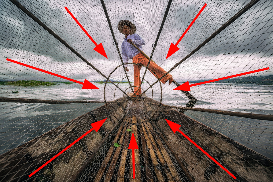
This is a fairly simple composition where the character is in the center. I framed the frame so that the fishing net creates diagonal lines that lead to the fisherman. The photo was taken on wide angle lens, the distortion helped give the image depth.

The focus in this shot is on the young monks, but I also wanted to capture the light and use the sun's rays as leading lines. By framing the image so that the monks were sitting under the rays, I was able to direct the viewer's gaze to their books. At the same time, the lines created by the wall on the left edge direct attention to the children themselves.

Here I framed the frame so that the young monk was in the left third of the image, with the columns on the right adding depth to the image. The lines of the gallery direct the eye towards the monk, while the lines of the ceiling lead the viewer's eyes downwards. The eyes of the monk himself, walking forward, are also lowered. This is a very simple but powerful composition shot with a wide angle lens.

Another shot where the character is in the center. Here I used a low angle for shooting and a wide angle lens for distortion - this allowed me to direct diagonal and horizontal lines towards the monk. Floor tiles also create leading lines that extend into the frame and keep the composition compact.

The composition in this shot is unusual for my work - I usually don't like slanted horizons. But in this case it worked great. I shot from a low angle while sitting on a boat. When the fisherman lifted the basket, a reflection appeared in the water, which added an additional line leading to the center of the frame. A horizon line running from the lower left to the upper right creates a diagonal composition.

Another fairly simple composition. The light was coming from the left, so I positioned the young monk on the right side of the frame so that he was looking in the opposite direction of the rays. Additionally, the light shining on the monk created a sharp contrast that helped make the photo stronger."
Lines are one of the main elements of the composition of any photograph. The lines largely determine where the viewer's gaze will be directed when looking at the photograph. Lines in compositional solution The photographs play a huge role; depending on their location, they express the dynamics of movement and give the photograph one or another mood.
The use of lines as powerful elements of composition goes back to architecture and the large paintings of antiquity. When creating a frame composition, the photographer must consider the arrangement of lines in such a way as to correctly organize all the elements of the photograph and improve their perception by the viewer. This article will discuss lines and their role in photographic composition.
Types of lines and their purpose in photography
When we talk about lines in photography, we mean any natural, man-made or speculative objects that serve as an auxiliary, organizing element in constructing the frame. For example, such objects in a photograph can be power lines, tram tracks, metal fences, rivers, paths, fences, car roads. They can have any size and configuration.
The purpose of such lines in the composition of a photograph can actually be multiple. Firstly, lines are needed to lead the viewer's eye into in the right direction to the compositional center or main object of the photo, thereby once again emphasizing it. Secondly, the purpose of lines in photography may be to give the picture additional dynamics, to express some kind of movement or even a sense of infinity. Thirdly, lines help to visually divide the photo into separate areas, concentrating the viewer's attention on the most important thing. And finally, photography that uses vertical, horizontal or diagonal lines, or a combination of them, becomes very interesting character. Lines allow the photographer to give the photo the necessary spatial depth for maximum expressiveness.

When creating a photo composition, the photographer can use Various types lines. There are several of them and each creates a particular feeling, ultimately exerting its own specific influence on the photograph:
-Horizontal lines
Horizontal lines are perhaps the most common in photography. The horizontal line can be, for example, a sea coastline or a road. As in architecture and painting, horizontal lines in photography convey a sense of calm, peace and balance. When using a horizontal line, the viewer's eye in a photograph usually moves along it very easily, from left to right. Such lines add a feeling of relaxation and infinity to the photographic image.

However, you need to be careful and not allow the presence of only horizontal lines in the photograph, since the pictures in this case may turn out to be too calm, rather boring and uninteresting. It is best to use a horizontal line as an element that leads the viewer's attention to the central subject of the photograph. Sometimes horizontal lines are also used by photographers to simply delimit an image into two or more areas. The main thing is that the horizontal line does not divide the frame into two equal parts.
— Vertical lines

Vertical lines, compared to the same horizontal ones, look more powerful in the picture; they are a kind of pillar of the entire composition. This line adds an impression of stability, strength and incredible power to the photo. A vertical line does not create tension in the frame and enhances the effect of the photo, adding a certain mood to it. Vertical lines also help give a photo a sense of height or, as with horizontal lines, divide the image space into separate areas. It is worth noting that if there are both horizontal and vertical lines in a photograph, a person’s gaze first moves horizontally, and only then along the vertical lines.
— Curved lines

Curved lines can have different influence on the perception and nature of the photographic image. If such a line turns out to be strongly curved, then this gives the composition of the photograph a certain instability. In addition, when seeing too curved or broken lines, the viewer has a subconscious feeling of tension associated with the idea that this line is bent or torn under the influence of certain forces. Strongly broken lines act on the viewer as a certain irritant. At the same time, lines that do not deviate too much vertically or horizontally in the photograph are perceived as stable and, accordingly, give the image a feeling of relaxation and calm. The winding lines of rivers in a landscape or the strong bends of a person’s body are also perceived by the viewer as stable, but at the same time he feels the presence of a certain tension in the photograph.
— S-shaped lines

S-shaped lines are lines with soft, smooth curves that are associated in our minds with contours or lines human body. This compositional element allows you to give the photo additional attractiveness. It’s not for nothing that the S-shaped line is called the “line of beauty.” Such a line can act in a composition both as a framing contour of the object being photographed and as a guide line. It is generally accepted that the S-shaped line, as opposed to simple horizontal and vertical lines, also adds a natural feel to the photo.
— Diagonal lines

Diagonal lines in the composition of the frame not only add dynamics to the image and, in fact, symbolize movement, but also simply attract the viewer’s attention. The starting point of the diagonal line is usually placed in one of the corners of the frame, and then the line is drawn either from the upper left corner to the lower right ("falling" diagonal), or from the lower left corner to the upper right corner ("rising" diagonal). The implementation of both versions of the diagonal line gives the viewer a feeling of tension in the movement.
Diagonals can also be used to direct the viewer’s gaze in such a way that, moving along diagonal lines, he fully perceives all the plot-important details of the photograph. Diagonal can connect main object shooting with a background image, thereby forcing a person to move his gaze into the frame. In addition, diagonal lines allow you to add depth and some spatial dimension to the photo. In this regard, a special effect occurs when there are any lines converging in the distance in the frame.
Of course, in order to learn how to use different types of lines correctly and, most importantly, appropriately, constant practice is required. When creating a photo composition, you must always find the right place for the lines in the frame. So that they help enhance the effect of the image or add a certain mood to it.
Skyline
Most often, when creating a photo composition, photographers are faced with the horizon line, actually the main line in photography. Often, when evaluating a photograph, you can hear the statement that “the horizon is blocked.” What does this mean? This phrase means that the horizon line does not run parallel to the bottom and top borders of the frame, that is, it literally falls on its side.
Blockage of the horizon– this is an amateurish, simple mistake, inherent mainly in novice amateur photographers. A littered horizon creates an unnecessary feeling of tension in the viewer. The viewer internally feels that something is wrong in the photograph. True, in some cases, blocking the horizon can also be a deliberate compositional technique used by photographers to increase the expressiveness of the frame. But still, in classical photography, the postulate is accepted that the horizon line should be strictly horizontal.
In order to obtain such a strictly horizontal line, it is necessary to compare the horizon line with the lower and upper boundaries of the frame in the viewfinder or on the camera’s liquid crystal display. It is clear that you need to ensure that these lines are parallel to each other. Modern cameras are often equipped with an electronic horizon function, or have special markers in the viewfinder or a mode that overlays a grid on the image, allowing the photographer to correctly position the subject and orientate himself with the horizon.
When we're talking about When photographing landscapes in complex terrain with jagged coastlines or mountain slopes, it can be difficult to determine where the horizon line is located. Some photographers use a tripod with a bubble level to determine the true horizon line in this situation.

Placing the horizon line exactly in the center of the frame is not the most the best option for the simple reason that most often the output is static, motionless and lifeless photographic images. It is still recommended to place the horizon line 1/3 from the top border of the frame if you want to focus the viewer's attention on the foreground, or 1/3 from the bottom border if the emphasis should be on the sky. In particular, if the sky or clouds look very interesting in the frame, then you should place the horizon line a little lower. If the landscape or some object seems to be the most interesting in the frame, then the horizon is placed higher.

However, this rule can sometimes be violated. For example, when it comes to creating a symmetrical photograph with a landscape reflected in water, it is quite appropriate to place the horizon line exactly in the middle of the frame. Another one practical advice by the location of the horizon line in the composition is that the horizon should not intersect with the lines of the photographed object. Otherwise, if the lines of the subject being photographed merge with the horizon, the viewer’s gaze may simply move away from the center of the composition and begin to wander around the frame.
In conclusion, it should be said that problems with the incorrect position of the horizon can be solved in the subsequent processing of photographs in a graphics editor. An uneven horizon can be corrected by Photoshop help and other similar programs. It's not a big deal. The main difficulty is to determine at what angle the image needs to be rotated to level the horizon. To find this optimal angle, use a horizontal or vertical ruler tool.
So, when we try to compose a shot in the viewfinder or on the LCD screen of our camera, we need to pay attention to close attention on line. They are the ones who can unite various compositional elements of the frame or separate them, determine the mood, expressiveness and dynamics of the photograph. Lines can be both a photographer’s assistant, enhancing a particular effect, and a real destroyer of the entire compositional solution.
The photographer's knowledge of the use of lines in the composition of the frame not only helps him create bright, interesting photographic images, but also allows him to understand how the viewer will view the photographs he has taken. Where will his gaze stop, what details of the image will he pay the main attention to, and what will be his general perception of the photograph.
The basis of any composition are points, lines and spots. Their configurations and compositional combinations form visible images. In order for the composition to take place as the artistic integrity of the image, it is necessary to arrange all its constituent elements in a certain way. But first, you need to understand what is meant by dots, lines and spots.
Dot
A dot is a very small element in an image. For example, a small berry lying separately in a still life or small wildflowers against the backdrop of a huge field can be considered dots. For composition, they serve as a center or to balance other larger objects.
However, the entire image can consist of dots. There was even a direction in painting - pointillism, whose representatives painted pictures by applying dots to the canvas. In modern reality, all digital images presented on a monitor and printed using any type of printers and printing presses consist of huge amount points that are no longer distinguishable today due to their extremely small size and high density of location on the plane.

Line
A line is formed in an image due to the contact of multi-colored or differently tonal spots, being their outline. Also, a line can be independent against a background that contrasts with it or be formed by points located in a row or along a different trajectory.
Lines add dynamism to the composition. For example, diagonally directed lines in an image create the illusion of movement. Horizontally located lines give the feeling of increasing the image in width, and vertical ones in height. Straight lines add tension to an image, while smooth, curved lines create a sense of calm.

Spot
A spot is a uniformly or unevenly painted area of an image. The spot can be formed by a concentrated accumulation of dots. The spot always has a border, even if it does not have clear outlines. Spots in the image make up most of it. They form the basis of the composition, filling its entire space. For the perception of the composition, the shape, color and ratio of the sizes of all spots in the image play an important role.
Using dots, lines and spots in a composition

Dot and spot
One of possible ways The combination of dots and spots in the composition is a juxtaposition of large and small. For example, to emphasize the scale of a building in a painting, it can be depicted as a spot that fills most Images. For comparison, place next to it an insignificantly small person, compared to the building, who will be depicted, almost like a dot.

Point and line
Most a shining example The use of lines and dots in the composition can be considered a road stretching into the distance along which cars are driving. The image of the road is mostly formed by lines going into the distance to the vanishing point. In this case, the cars will turn from small spots, as they move away from the viewer, into dots. This effect perfectly demonstrates the effect of perspective.

Line and spot
The most a clear example The use of lines and spots in a composition is to fill the spots with an ornament of lines. For example, two square spots of the same size, located side by side in one image, but having different ornament, will be perceived differently. If one square is filled with vertical lines and the other with horizontal lines, then the first square will appear taller and the second more elongated in width.


Chicken skewers Chicken skewers with bacon
Mushroom glade salad with honey mushrooms recipe with photos How to prepare mushroom glade salad with honey mushrooms
Very tasty lecho: recipe with carrots
Minced meat for dumplings - preparing hearty meals at home
Honey cake with sour cream